参数
| 参数 |
说明 |
类型 |
可选值 |
默认值 |
| value |
绑定值,用于初始化按钮状态和外部改变按钮状态 |
—— |
—— |
—— |
| iconShow |
是否显示icon |
boolean |
true false |
true |
| range |
取值范围,用于描述按钮各个状态的UI表现 |
array |
—— |
[0, { value: 1, active: true }] |
| range.active |
通用选中状态 |
boolean |
true false |
—— |
| range.special |
通用图标红色选中状态 |
boolean |
true false |
—— |
| disabled |
是否禁用 |
boolean |
—— |
false |
| disabledColor |
禁用状态的颜色 |
string |
—— |
#DCDDE2 |
| themeColor |
主题色 |
string |
—— |
#0082FF |
| icon |
icon的名称 |
string |
—— |
—— |
| label |
文字 |
string |
—— |
—— |
| pushChecker |
事件触发前的检查函数,如果不为空,则执行该函数,不会执行change事件 |
function |
—— |
—— |
Event
| 事件名称 |
说明 |
回调参数 |
| change |
value发生改变的回调 |
新的value |
Methods
| 方法名称 |
说明 |
参数 |
| resetRange |
重置为初始值 |
—— |
使用示例
1、range取值和value初始值
// 可以是简单参数,也可以是对象,为对象时,value字段必须存在
// range中的字段影响当前值下的UI展现,如果取值不存在,则使用props对应的字段
attr: {
  val1: 0
},
[
  0,
  {
    value: 1, // 取值
    icon: 'icon-kaiguan', // icon
    label: '开关', // 文字
    disabledStyle: {}, // 禁用样式
    iconStyle: {}, // icon样式
    buttonStyle: {}, // 按钮样式
    active: false // 选中样式快捷书写,当v-model的值和range中的值一致时,样式为选中,常用于互斥
  }
]

<push-group>
  <push-button :range="range1" v-model="attr.val1" icon="icon-kaiguan" @change="onChange"
  ></push-button>
</push-group>
2、在 computed 计算属性中使用vuex数据值
// computed 计算属性中使用

// 温度设置
computed
    windSelstateVal: {
      get: function () {
        return this.$store.state.publicInfo.attr.targetTemperature;
      },
      set: function (val) {
        // this.$store.state.publicInfo.attr.targetTemperature = val;
        this.$store.dispatch('setDeviceStatus', {
          targetTemperature: val
        })
      }
    },
}

// 在html 中的 push-button 使用 v-model 使用该值
<push-button v-model="attr.val1" v-model="windSelstateVal" ></push-button>
3、一排多个,会通过flex自动布局
<template>
  <div>
    <push-group>
      <push-button :range="range1" icon="icon-kaiguan" label="关"></push-button>
      <push-button :range="range2" icon="icon-shezhi" label="2档"></push-button>
      <push-button :range="range3" icon="icon-dianhua" label="3档"></push-button>
    </push-group>
  </div>
</template>

<script>
import { PushButton, PushGroup } from 'genie-ui'
export default {
  components: {
    PushButton,
    PushGroup
  },
  data () {
    return {
      range1: [
        0,
        {
          value: 1, // 取值
          label: '开', // 文字
          disabledStyle: {}, // 禁用样式
          iconStyle: {}, // icon样式
          buttonStyle: { color: '#fff', background: '#FFA43D', borderColor: '#FFA43D' },
          active: false // 选中样式快捷书写,当v-model的值和range中的值一致时,样式为选中,常用于互斥
        }
      ],
      range2: [...],
      range3: [...],
    }
  },

  methods: {
    onChange (v) {
      console.log('change', v)
    }
  }
}
</script>
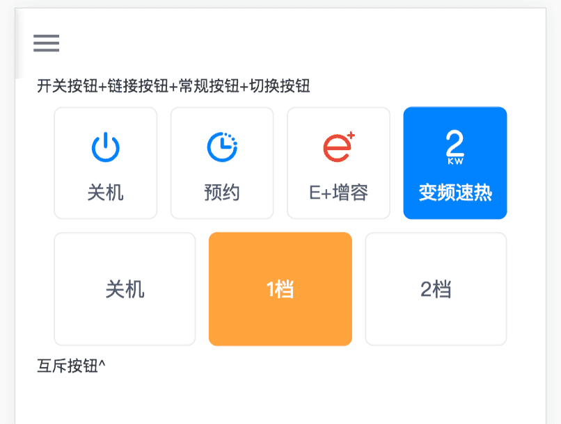
4、互斥逻辑
<template>
  <!-- 设置相同的v-model -->
  <div>
    <push-group>
      <push-button :range="range4" v-model="attr.val4" icon="icon-kaiguan" theme-color="#FFA43D"
        @change="onChange"
      ></push-button>
      <push-button :range="range5" v-model="attr.val5" label="1档" theme-color="#FFA43D"
        @change="onChange" :disabled="attr.val4 === 0"
      ></push-button>
      <push-button :range="range6" v-model="attr.val5" label="2档" theme-color="#FFA43D"
        @change="onChange" :disabled="attr.val4 === 0"
      ></push-button>
    </push-group>
  </div>
</template>

<script>
import { PushButton, PushGroup } from 'genie-ui'
export default {
  components: {
    PushButton,
    PushGroup
  },
  data () {
    return {
      attr: {
        val4: 0,
        val5: 0
      },
      range4: [
        { value: 0, label: '开机', iconStyle: { color: '#EA4335' } },
        { value: 1, label: '关机' }
      ],
      range5: [{ value: 0, icon: 'icon-shezhi',
        buttonStyle: { color: '#fff', background: '#FFA43D', borderColor: '#FFA43D' },
        iconStyle: { color: '#fff' }
      }],
      range6: [{ value: 1, icon: 'icon-dianhua',
        buttonStyle: { color: '#fff', background: '#FFA43D', borderColor: '#FFA43D' },
        iconStyle: { color: '#fff' }
      }]
    }
  },

  methods: {
    onChange (v) {
      console.log('change', v)
    }
  }
}
</script>
FAQ
关于此文档暂时还没有FAQ